Selected work · 2026

End-to-end,
UX Case Studies.

UX stories spanning enterprise sales, workplace tools, health analytics and environmental technology. Each starts with a distinct challenge and follows the work from discovery through delivery.

← All case studies
02 — Salesforce · UX strategy

Salesforce SBR Solution.

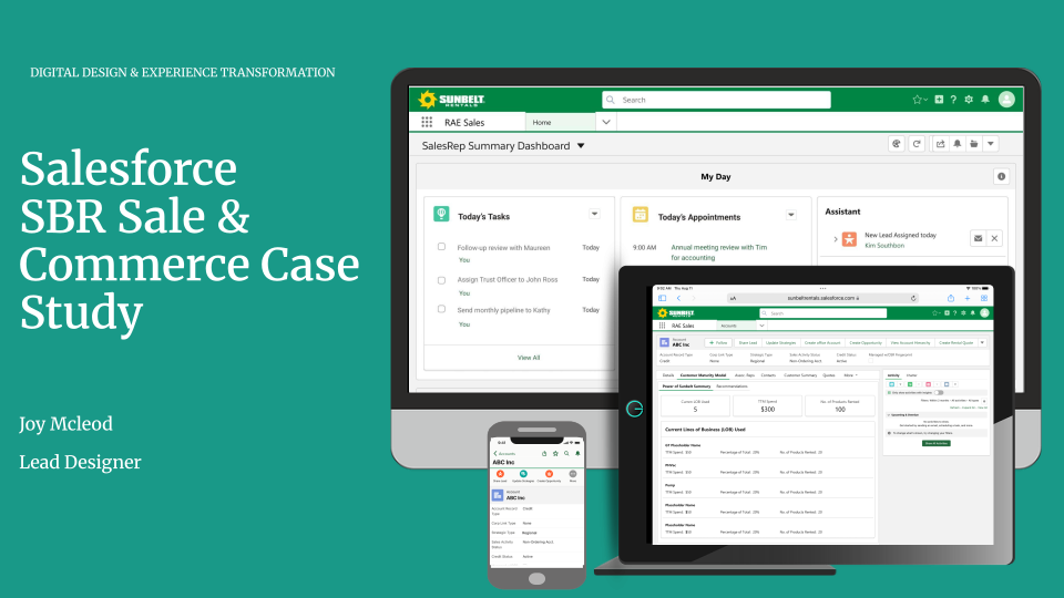
A unified renewal workflow that brought together fragmented systems, customer context and proactive next steps for sales teams.
RoleUX Design Lead,
Research & Strategy
FocusRenewal workflows,
CPQ & pipeline visibility
Outcome30% faster renewal
process
Salesforce SBR sales and commerce dashboard across desktop and mobile
DiscoverInterviews & renewal journey mapping
DefinePersonas, priorities & information architecture
DesignFlows, wireframes & high-fidelity prototype
ValidateUsability testing, handoff & iteration

Renewal was spread across too many places.

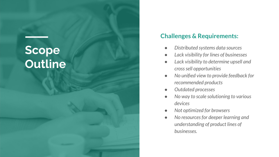
I led the redesign of the Salesforce workflow to address the friction created by fragmented systems, manual data entry and limited pipeline visibility. Sales teams needed one reliable place to understand the customer, move a renewal forward and know what to do next.

Responsibilities

  • UX design lead, research & strategy
  • Wireframing & prototyping
  • Usability testing
  • Design system implementation
Salesforce SBR scope showing the connected renewal workflow
Solution scope

I mapped the renewal journey before designing the workflow.

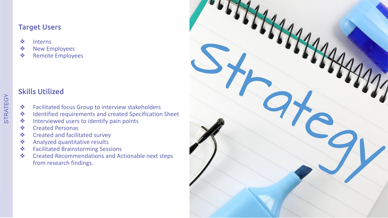
I interviewed sales reps, regional managers and operations partners, then mapped the end-to-end renewal journey and created personas. The research surfaced redundant entry, unclear pipeline visibility and a lack of proactive alerts for expiring contracts.

The strategy and research phases established a shared, user-centered foundation for the work—before moving into design, testing and iteration.

UX process & methodology
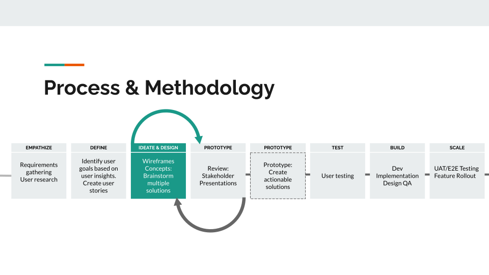
Salesforce SBR UX process and methodology
UX process & methodology
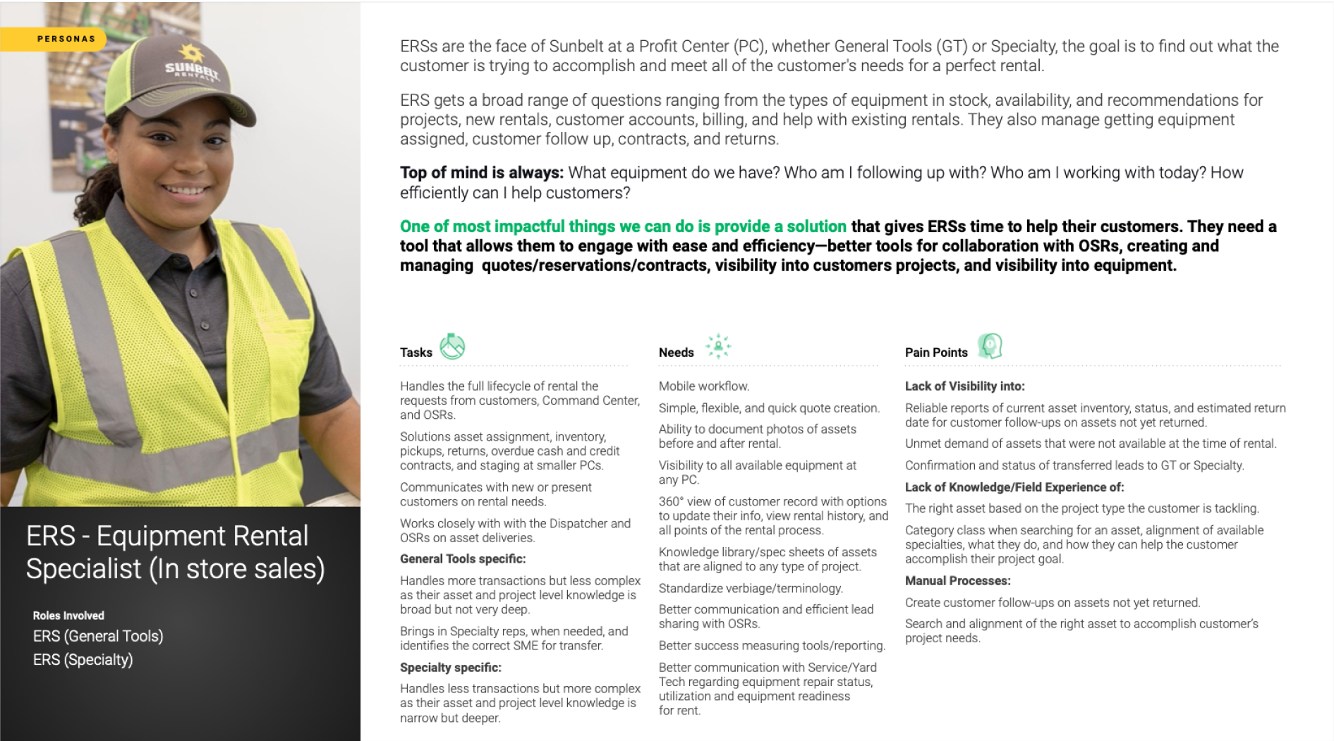
Salesforce SBR equipment rental specialist persona
Primary persona · equipment rental specialist
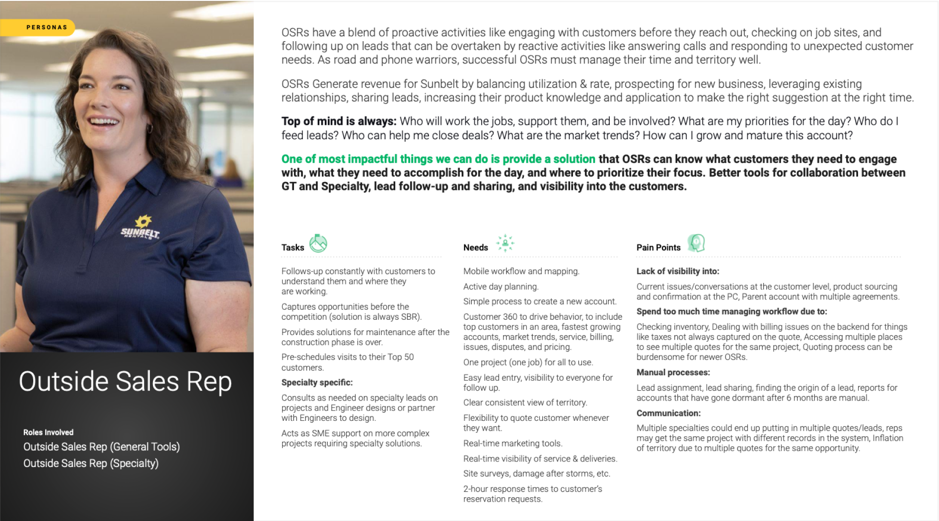
Salesforce SBR outside sales representative persona
Secondary persona · outside sales representative

Made the customer story easier to scan and act on.

Card-sorting sessions and user flows helped reveal how users naturally grouped and prioritized information. That input shaped an intuitive information architecture and flow for a 360° customer view, including history, product usage and recommended upsell or cross-sell opportunities.
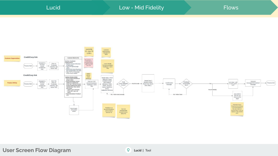
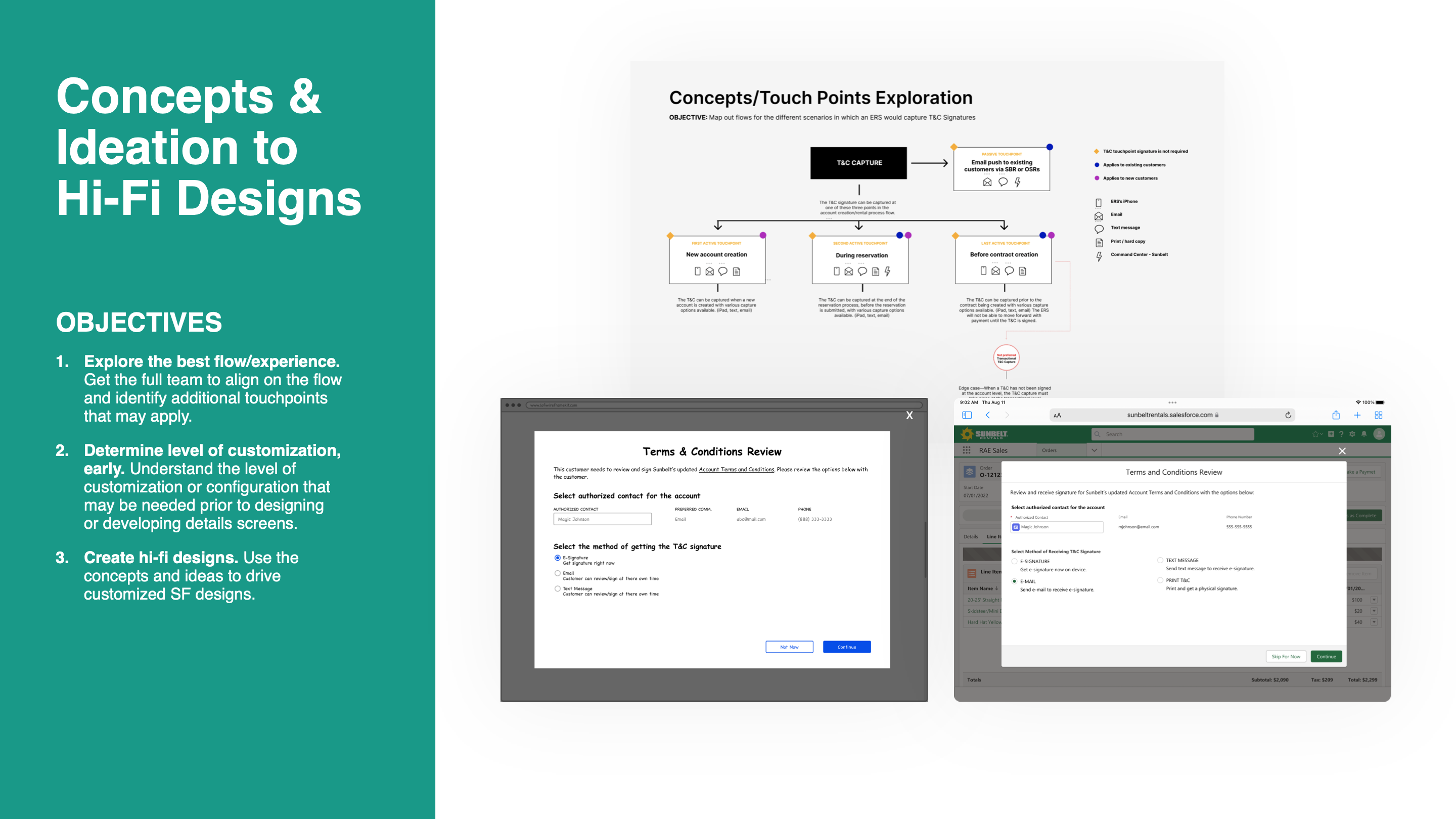
Salesforce SBR information architecture and user flow
Information architecture & flow
SBR presentation slide showing concept and touchpoint exploration
Concept direction

Prototyped the whole workflow, and refine it with users.

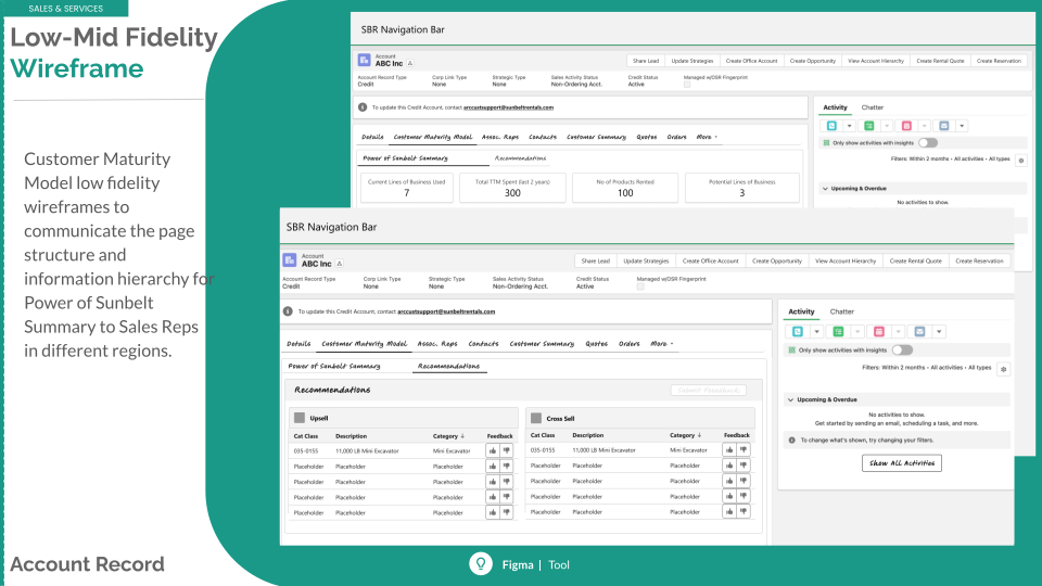
Low- to medium-fidelity wireframes made it possible to test the core workflow early. High-fidelity prototypes then brought the experience closer to the finished product, with polished screens, realistic interactions and clear documentation for engineering.

  • Built interactive flows to simulate real sales workflows.
  • Tested navigation, ease of use and task completion with stakeholders and end users.
  • Used working prototypes to align executives, product and engineering.
  • Prepared specifications, component documentation and style guidance for handoff.
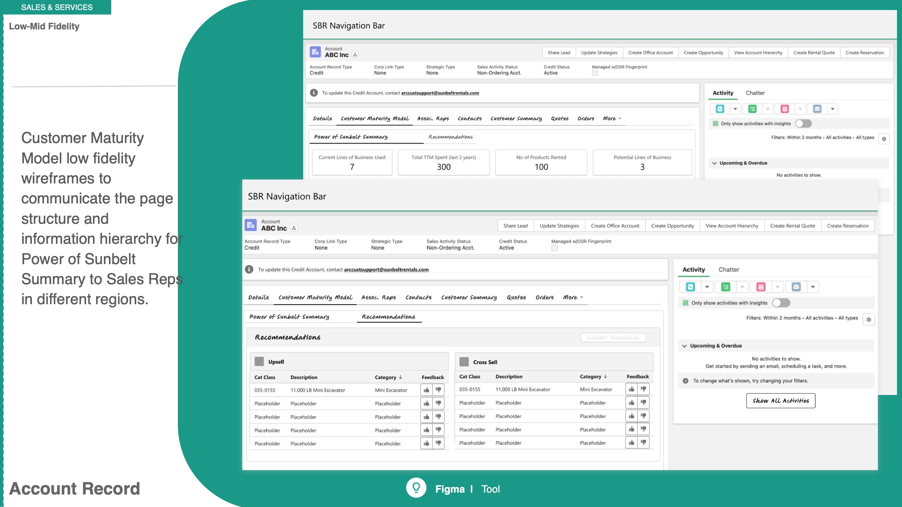
SBR presentation slide showing low-fidelity account record wireframes
Low-fidelity account record

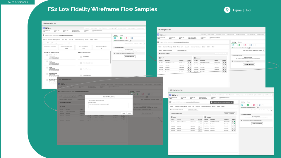
Detailed low-fidelity exploration

SBR low-fidelity account record wireframes
Low-fidelity account record exploration
SBR low-fidelity wireframe flow samples
Low-fidelity workflow exploration

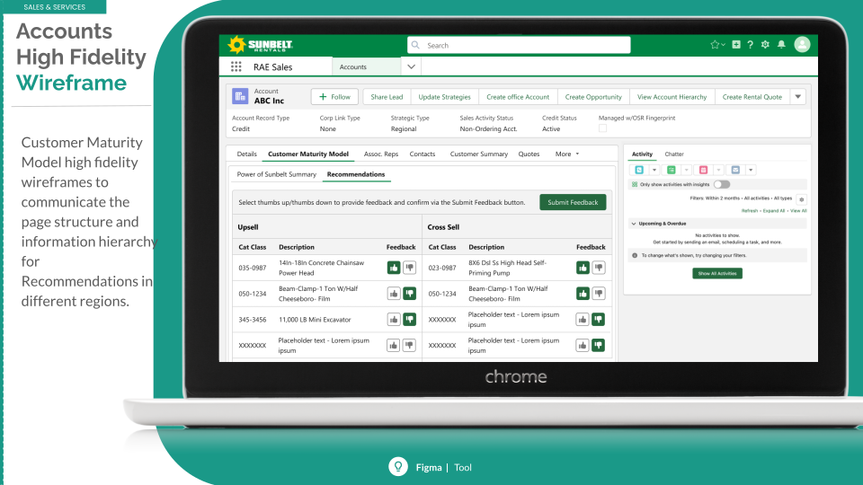
High-fidelity prototype details
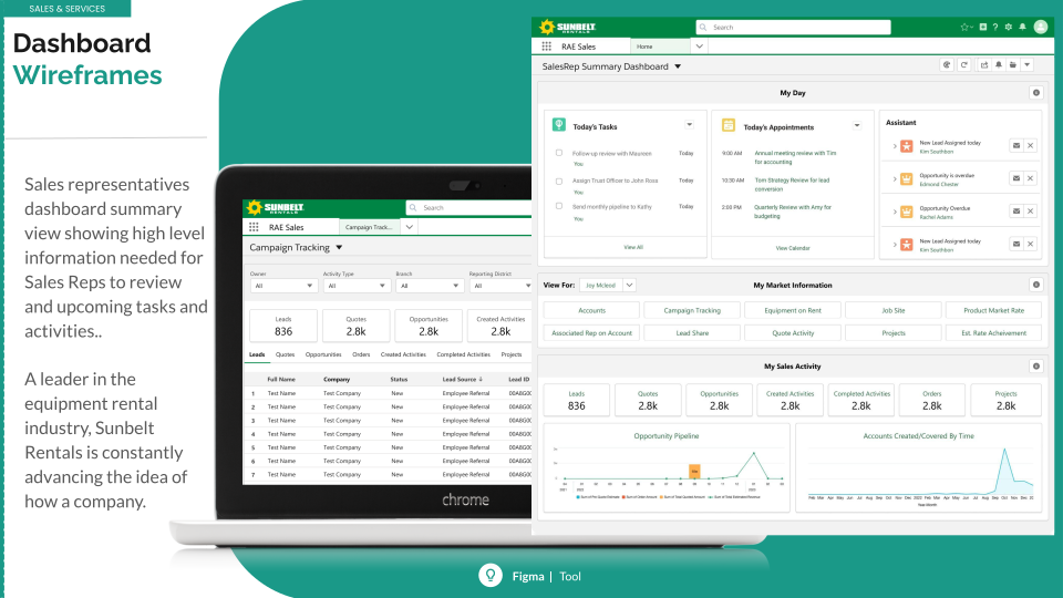
SBR high-fidelity sales dashboard wireframes
Sales dashboard
SBR high-fidelity account prototype
Account experience
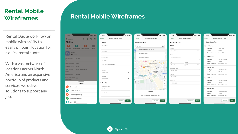
SBR rental mobile wireframes
Rental mobile experience
SBR mobile sales release designs
Mobile release enhancements
Efficiency30% faster

Renewal completion time was reduced through a more connected workflow.

VisibilityClearer forecasts

Unified pipeline information improved forecasting accuracy.

AdoptionOne primary tool

Salesforce became the central place for sales reps to manage renewal work.
← All case studies
03 — Research · Strategy · UI

Start Dot Solution.

A centralized intranet resource hub designed to help employees find workplace tools, documents and support without losing momentum.

RoleUX Design Lead,
Research & Strategy
FocusInformation architecture,
onboarding & access
PlatformsResponsive web,
desktop & mobile
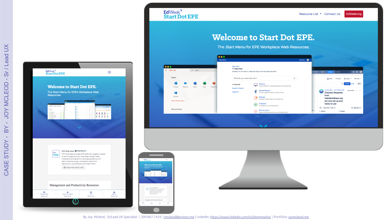
Start Dot workplace resource hub interface
DiscoverFocus groups, surveys & content inventory
StructureScenarios, stories, sitemap & flows
DesignWireframes, branding & prototype
LearnAnalytics, feedback & iteration

A workplace central hub, for distributed resources.

StartDot EPE is an intranet product that acts as a mini information architecture site for an organization. It gives employees a centralized base for workplace productivity resources—from remote document access to communication, collaboration and service tools.

Responsibilities

  • UX design lead, research & strategy
  • Wireframing & prototyping
  • Usability testing
  • Design system implementation

New and remote employees could not quickly find what they needed.

  • There was no central location for essential resources.
  • Documents were difficult to access remotely.
  • Tracking down the right service took too much time.
  • New employees faced a delay in productivity and learnability.

The solution

The resulting hub provides easy access for internal and external users without software downloads, works with the existing data warehouse, and is designed to need no prior training. It is responsive, cross-browser compatible and includes user feedback plus analytics to support continued improvement.

Understand needs, then make engagement measurable.

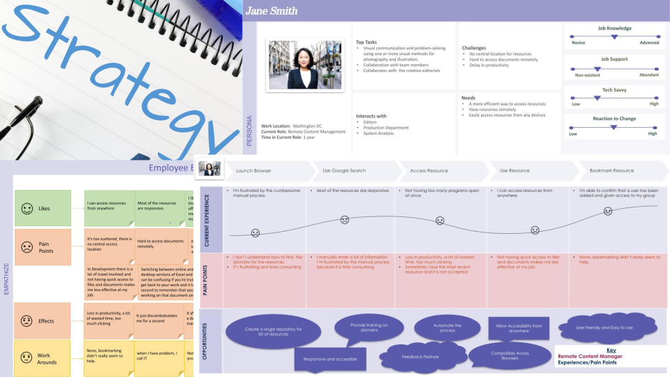
Brainstorming, focus groups, surveys, metric analysis, content inventory, scenarios, user stories and flows helped turn a broad resource problem into a focused, usable experience. Empathy mapping, personas and journey mapping made the human context visible to the team.

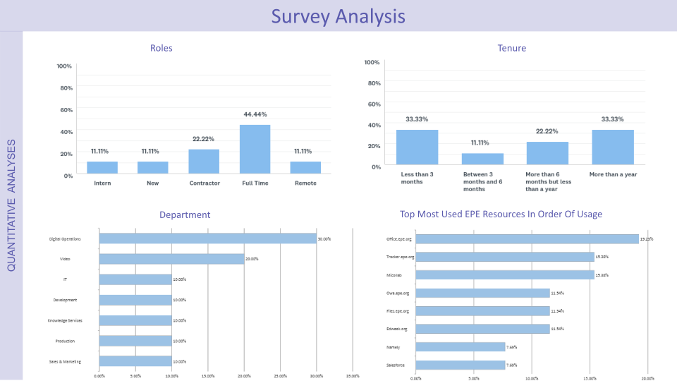
Quantitative UX analysis then measured effectiveness, usability and adoption—using behavior, engagement and performance metrics to evaluate StartDot as a centralized workplace resource.

Research foundation

Start Dot research strategy showing target users and research activities
Target users & research activities
Start Dot strategy collage with an empathy map, persona and employee journey
Empathy mapping, personas & journey mapping

Quantitative UX analysis

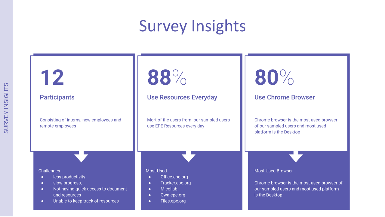
Start Dot survey insights showing participant count, everyday resource use and browser use
Survey insights
Start Dot quantitative analysis of employee engagement and resource use
Engagement & performance analysis

I gave the resources a structure that users can recognize.

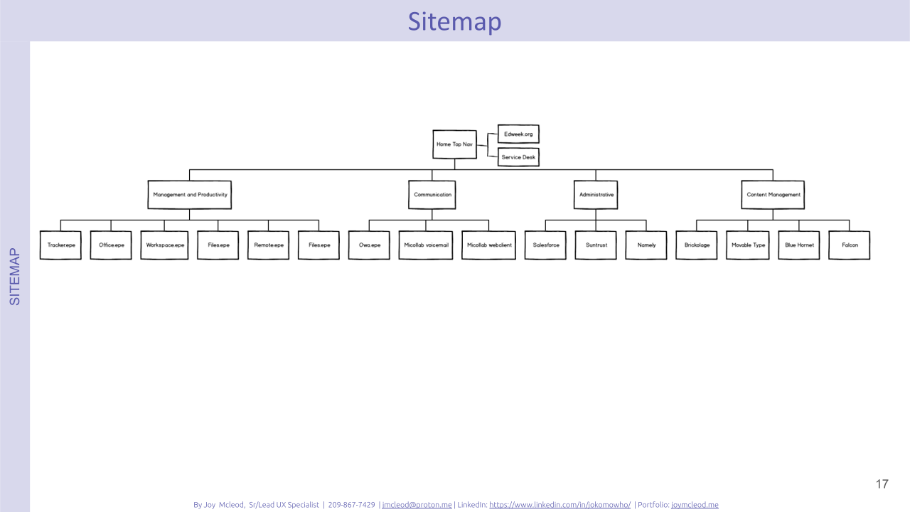
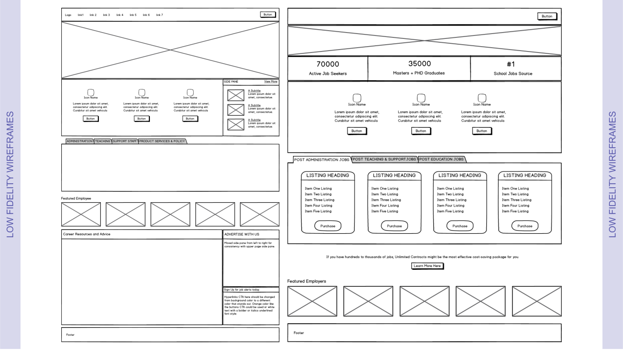
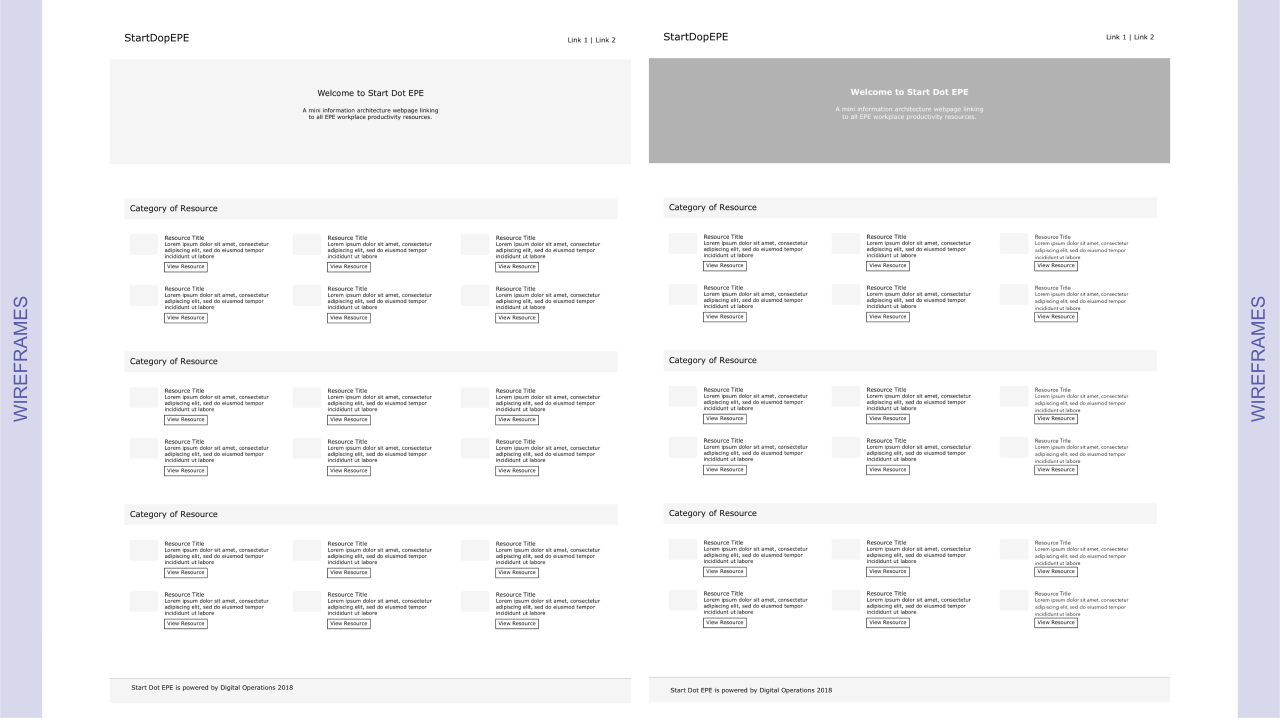
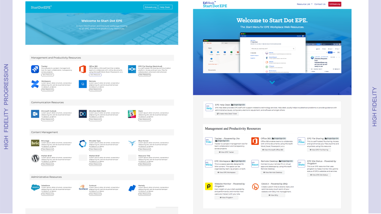
Open and closed card-sorting sessions informed a practical sitemap and information architecture. Low- to medium-fidelity wireframes clarified core functionality early, while the high-fidelity interactive prototype used established visual style guidance and realistic workflow interactions.

  • Created polished, brand-aligned responsive screens.
  • Added interactive flows to mirror actual employee tasks.
  • Tested navigation and task completion with users and stakeholders.
  • Used prototypes to gain alignment and support a smooth engineering handoff.

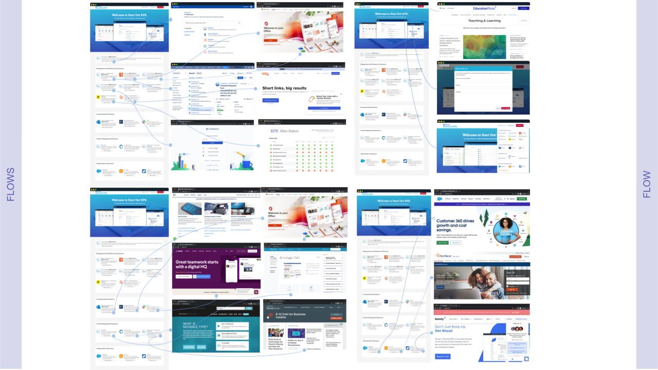
Information architecture

Start Dot information architecture sitemap and flow
Information architecture & flow

Low- to medium-fidelity exploration

Start Dot low- to medium-fidelity wireframe exploration
Low- to medium-fidelity wireframes
Start Dot wireframe workflow
Core resource workflow

High-fidelity prototype

Start Dot high-fidelity product prototype
High-fidelity prototype
Start Dot responsive high-fidelity interface
Responsive interface
AccessOne clear hub

Employees can reach work resources from one intuitive starting point.

ConfidenceLow learning curve

The structure is designed to be useful without training or special software.

LearningFeedback loop

Behavioral analytics and feedback create a basis for continuous improvement.

← All case studies
04 — Data UX · Dashboard

MG Analytical Dashboard.

A responsive analytics tool that helps health administrators see performance patterns across regions, states and individual health centers.

RoleUX Design Lead
AudienceHealth administrators,
managers & policymakers
Impact70% less decision
making time
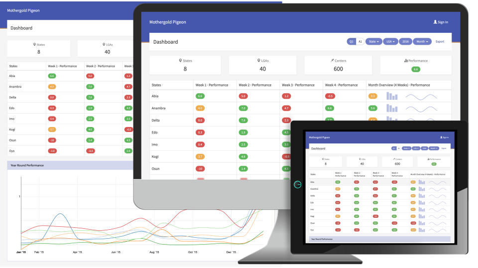
MG Analytical Dashboard interface
ResearchStakeholder interviews & data needs
PrioritizeKPIs, comparison needs & mobile access
PrototypeWireframes, dashboards & responsive UI
IterateUsability testing & evidence-led refinement

Brought performance data into a clear, decision ready view.

MG Analytical Dashboard is a web and mobile application for exploring health-center performance across a country. It helps health professionals, administrators and policymakers track key metrics at the regional, state and individual center level.

Responsibilities

  • UX design lead
  • User research
  • Wireframing & prototyping
  • Usability testing

Complex data needed to become easier to compare and understand.

Administrators and policymakers needed a centralized, data-driven way to assess the performance of health centers. I interviewed healthcare administrators, health center managers and policymakers to understand data needs, workflow challenges and decision-making requirements.

Key findings

  • Data views needed to be customizable around relevant KPIs.
  • Mobile access was essential for on-the-go insight.
  • Complex data had to be simplified without losing meaning.
  • Comparing performance across states and centers was a priority.

Made important signals visible.

The dashboard design approach translated data requirements into visual stories. High-level KPIs lead the experience, with drill-down controls for more granular analysis. Pie, area and bar charts show distribution within selected date ranges, while the responsive layout adapts for tablets and smaller screens.

  • Color coding: green, yellow and red signal positive, warning and critical performance levels.
  • Data hierarchy: high-level KPIs appear first, with clear paths to details.
  • Mobile responsiveness: layouts and chart interactions were optimized for tablet use.
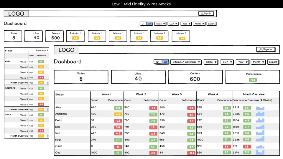
MG dashboard low and medium fidelity designs
Low- to medium-fidelity wireframes
MG Analytical Dashboard interface
Featured dashboard experience

Tested clarity of indicators for decision making.

Usability testing with 10 administrators and health managers assessed navigation, data clarity and feature usefulness. The results led to quick filters for choosing health centers, tooltips and guided walkthroughs to reduce cognitive load, and stronger visualizations and tap targets for mobile.

Speed70% less time

Decision-making time for administrators was reduced.

AdoptionHigher uptake

Health officials adopted the dashboard more readily after usability improvements.

MobileMore engagement

Enhanced mobile design made dashboard use easier away from a desktop.

Next case studyDiakrino Product
← All case studies
05 — Product design · UX

Diakrino Product.

A more accessible way for researchers, organizations and prospective clients to explore complex environmental dispersion modeling software.

RoleUX Design Lead
FocusTechnical content,
model comparison & demos
Impact better conversion
conversion
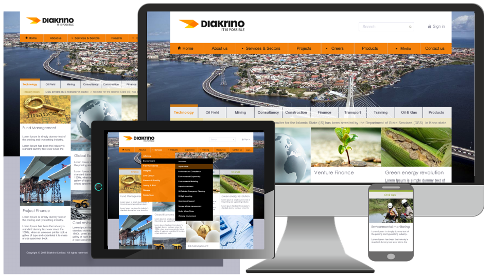
Diakrino environmental modeling product interface
ResearchInterviews, surveys & competitive analysis
FrameFeatures, use cases & decision criteria
DesignFlows, visual hierarchy & prototype
ImproveTesting, content clarity & performance

Technical modeling tools was difficult to evaluate.

Organizations and environmental researchers needed an intuitive way to explore, compare and understand environmental dispersion. Existing platforms often relied on dense technical content, which made key features, applications and benefits hard to absorb.

Responsibilities

  • UX design lead
  • User research
  • Wireframing & prototyping
  • Usability & interaction design

The solution

The product was designed as a modern, user-friendly web application that clearly presents capabilities, use cases and environmental models while making the experience engaging and informative for prospective customers.

Learned from the user's perspective.

Interviews and surveys brought together the perspectives of environmental scientists and researchers, government and regulatory officials, and business clients in industrial, urban planning and energy sectors. Research also examined competing modeling platforms.

  • Technical content was overwhelming and poorly structured.
  • Competitors rarely provided interactive demos or visual model comparisons.
  • Pricing was often unclear, making it harder for customers to decide.
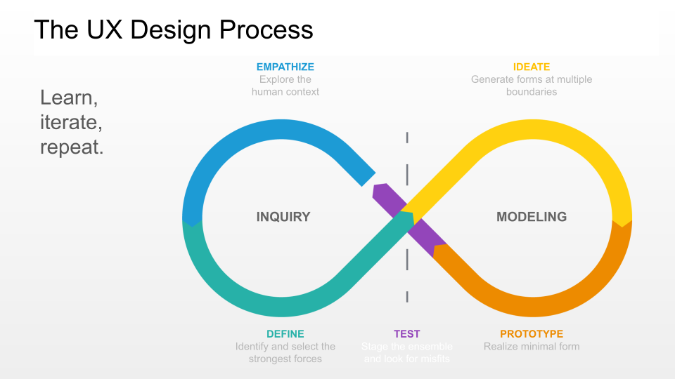
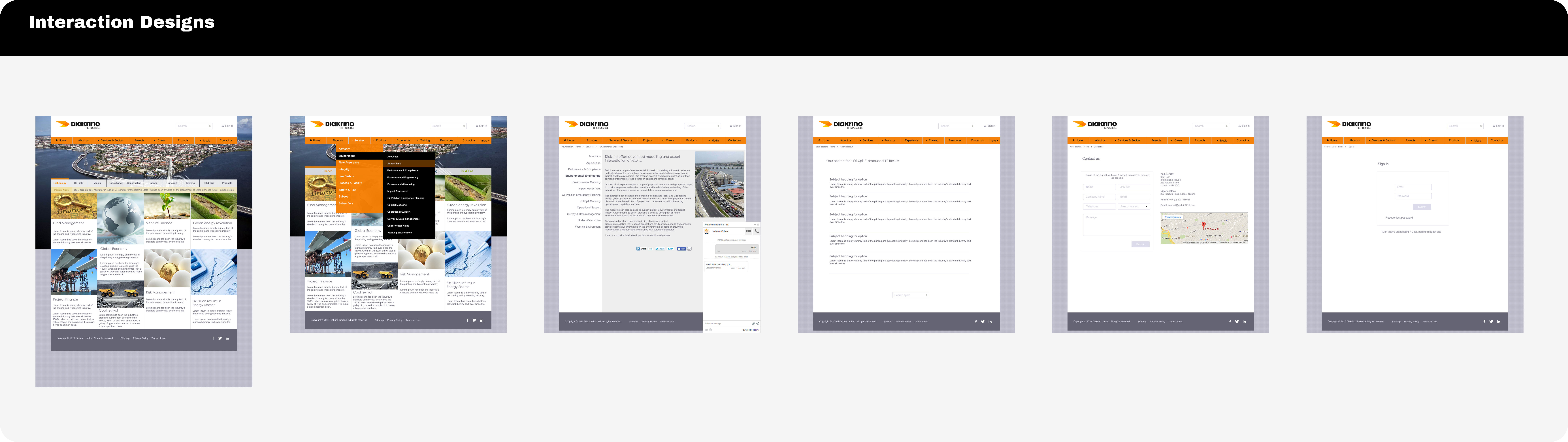
Diakrino UX process
UX process

Used interaction to make the screenflow easier to see.

Low- to medium-fidelity wireframes established a clear product story: an overview, feature breakdown with interactive environmental comparisons, real-world case studies. Interaction flows then tested how people would move through that story.

Diakrino interaction design flows
Interaction design flows

Brought information on environmental models closer to user's finger tips.

The high-fidelity prototype focused on making the software approachable while preserving its technical depth. It combined clear content hierarchy with practical environmental product interactions and responsive layouts for desktop, tablet and mobile.

  • Interactive model explorer: compare and understand dispersion models.
  • Live simulation preview: experience the model in action.
  • Reports & exports: access compliance reports and analytical data.
  • Clear pricing: compare licensing options without guesswork.
  • Mobile-ready UI: maintain usability across devices.
Diakrino high-fidelity product design
High-fidelity prototype

Testing & iteration

Usability testing with 10 participants focused on navigation, information clarity and engagement. The team introduced tooltips and a glossary for non-experts, added interactive real-world scenarios, and optimized lightweight animations and caching to improve preview performance.

Engagement40% increase

Time spent on the site increased with a clearer, more engaging experience.

Conversion30% improvement

Demo requests and sign-ups improved through better information and paths to action.

OnboardingLess friction

Clearer language and guidance made complex data easier to approach.

← All case studies
01 — Aviation · Enterprise CRM · AI

Bombardier Salesforce AI Transformation.

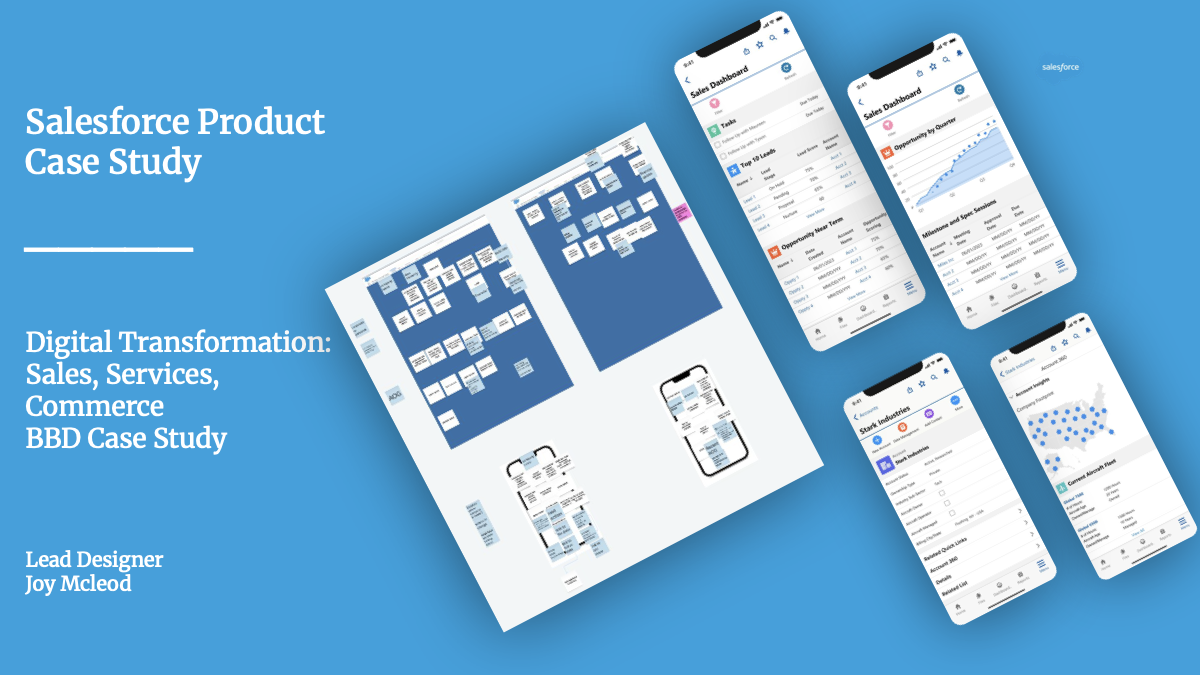
A Salesforce transformation that brought Sales & Services workflow, 360° customer and aircraft context, and AI-assisted next steps into one decision-ready experience.

RoleLead Designer
ScopeSales, services
& commerce
PlatformSalesforce, CRM Analytics
& SF Design System
Bombardier Salesforce product transformation concept, including mobile sales dashboards and service workflow artifacts
Discover15 interviews & reverse demos
MapCurrent- and future-state workflows
DesignConcepts, flows & responsive UI
ValidateFeasibility reviews & testing

Sales and service teams had data, but not a dependable view of their work.

Bombardier’s Sales & Services teams needed a clearer way to see pipeline health, customer interactions, aircraft and service context, contract limitations, and the work required to move a deal forward. Information lived across systems, which made it harder to prioritize customers, create proposals, manage renewals and keep Salesforce current.

The opportunity was not simply to add another dashboard. It was to make Salesforce the trusted, single place for the customer story and the next action.

My contribution

  • Lead experience design across discovery, synthesis and future-state planning.
  • Translated research findings into requirements, concepts and screen flows.
  • Guided Salesforce-native responsive design using CRM Analytics and the Salesforce Design System.
  • Supported stakeholder reviews, technical feasibility conversations and validation.
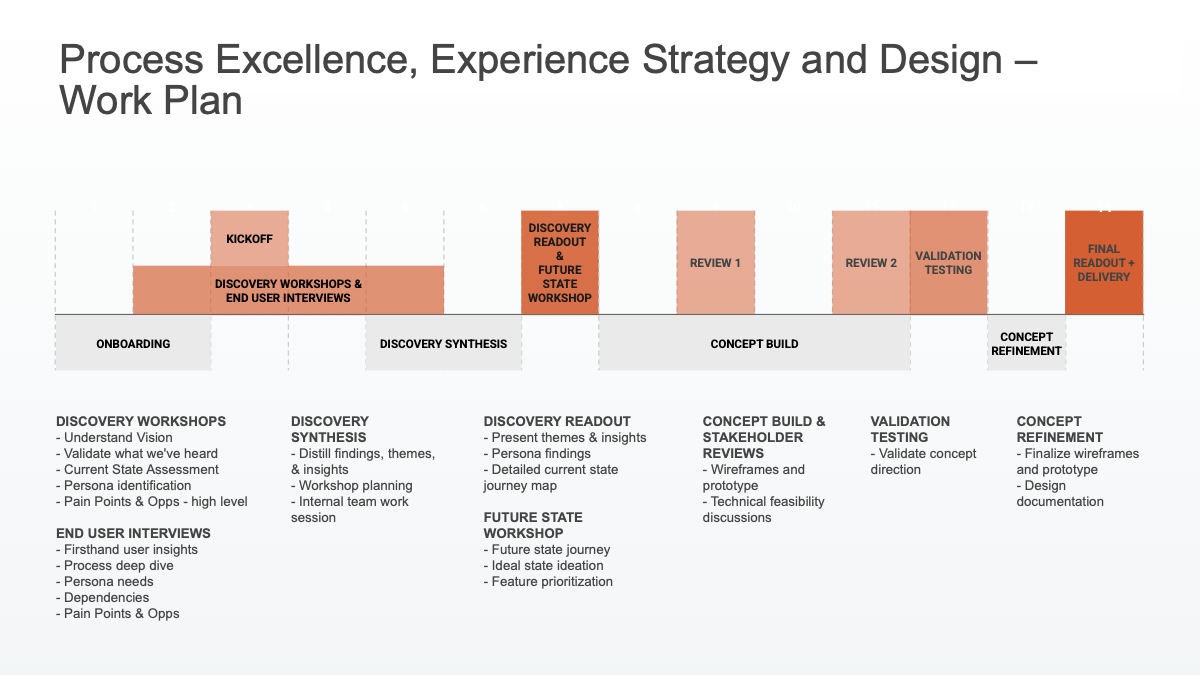
Bombardier Sales and Services experience strategy and design work plan
Research, concept and validation work plan

Started with the work behind every opportunity.

Research focused on understanding the day-to-day work, constraints and opportunities shaping an ideal future state for AI in Bombardier sales. The study combined interviews across Smart Services and New Aircraft Sales with reverse demos and pre-discovery recordings.

Research15 interviews

Total interviews completed across Smart Services and New Aircraft Sales.

Smart Services3 interviews

Input from the service side of the sales and customer workflow.

New Aircraft Sales6 + 6 interviews

Perspectives from U.S. & Canada and international sales teams.

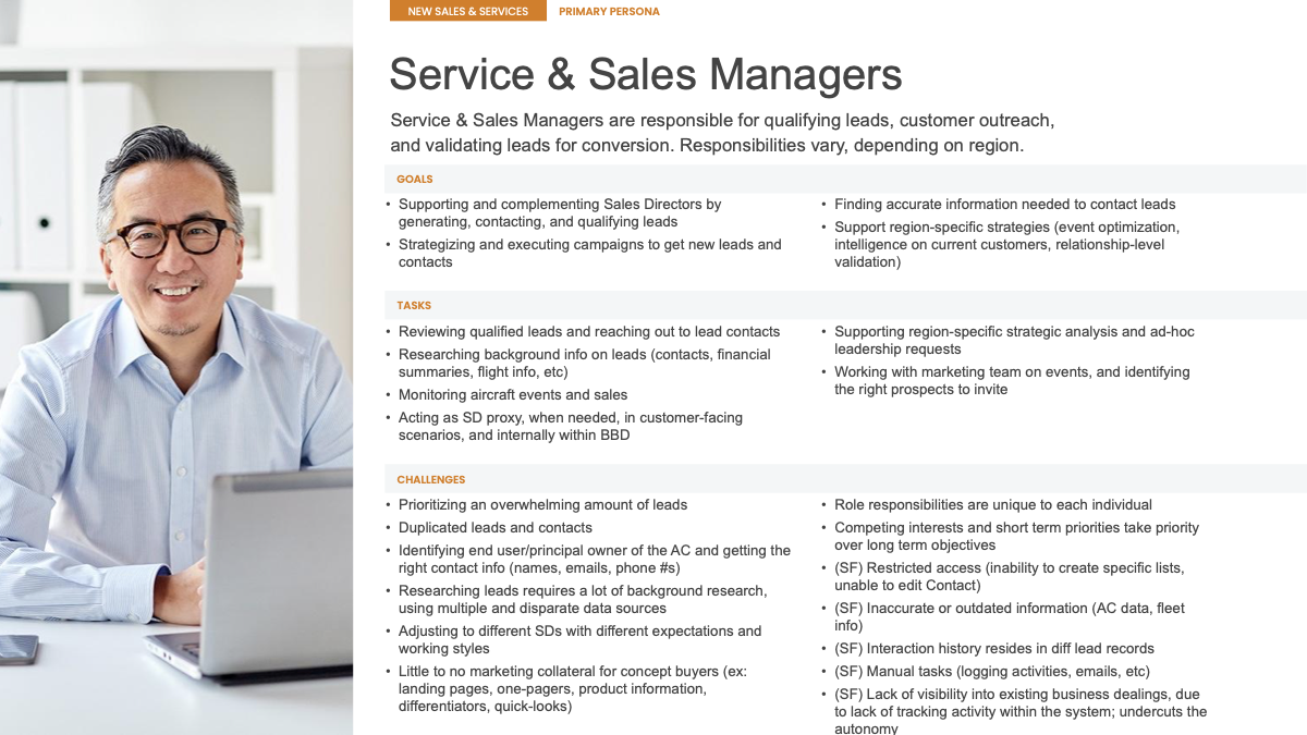
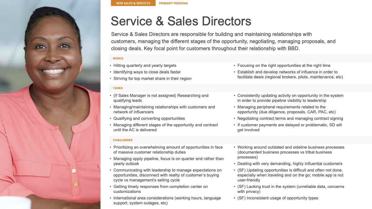
Service & Sales Managers and Directors were the primary personas. Managers needed to qualify and prioritize leads while assembling background information from disparate sources; Directors needed to manage relationships, opportunities, proposals and contracts, often while travelling and managing competing demands.

Design around the people carrying the pipeline forward.

Service & Sales Managers and Directors were the primary personas shaping the experience. Their research-backed goals, tasks and friction points kept the work grounded in the realities of qualifying leads, sustaining customer relationships and moving opportunities to close.

VPs of Sales, Sales Account Representatives and Lead Generation were also identified as secondary personas whose needs informed supporting features and use cases.

Service and Sales Manager persona showing goals, tasks and challenges related to lead qualification, outreach and customer context
Primary persona · Service & Sales Manager
Service and Sales Director persona showing goals, tasks and challenges related to relationships, opportunities, proposals and contracts
Primary persona · Service & Sales Director

Journey Mapping for Current and Future State.

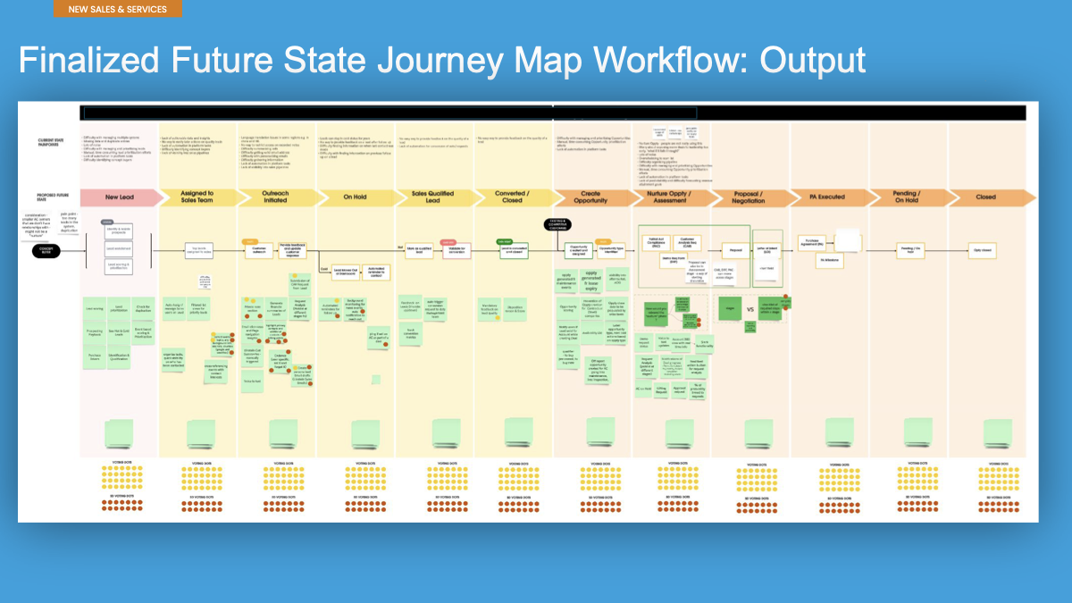
Current- and future-state journey mapping made handoffs, disconnected systems and repeated manual work visible. The resulting future-state workflow traced the path from lead through opportunity and close, while connecting the supporting Customer 360, reporting and Aircraft 360 information teams needed along the way.

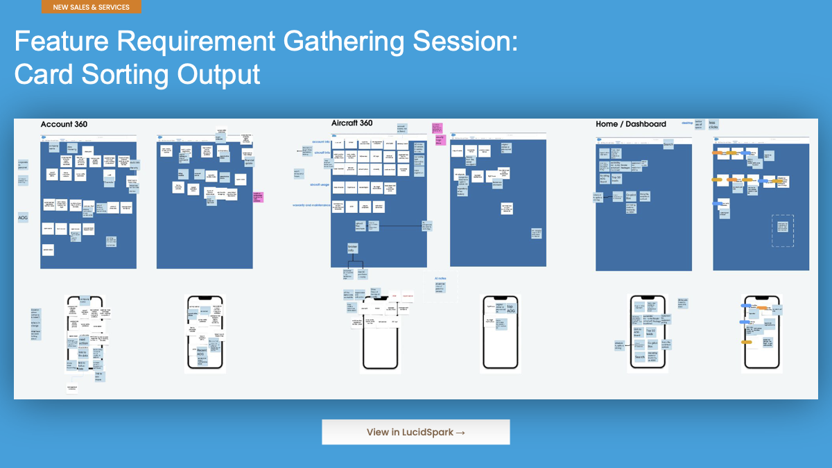
Card sorting then turned a broad set of needs into a clearer product model. The process helped align what belonged in the dashboard, account, aircraft, lead and opportunity experiences before the team moved into detailed UI.

Problem → insight → design decision

  • Fragmented activity: bring lead, opportunity and service workflow into a more connected Salesforce path.
  • Missing context: pair Customer 360 and Aircraft 360 information with the sales workflow.
  • Manual prioritization: introduce real-time signals, scoring and recommended next actions.
  • Slow renewals: support CPQ-driven proposal and renewal automation.
Finalized future-state workflow from lead to closed opportunity
Future-state sales and services workflow
Feature requirement card-sorting output across account, aircraft, dashboard and lead views
Feature requirement card sort

Feature Prioritization.

Feature prioritization connected interview evidence, UX strategy and stakeholder input to a feasible Salesforce product direction. High-priority needs included a real-time sales dashboard, regional activity notifications, dynamic filtering and search, automated stage progression, recommended actions and product ownership history. AI-driven pipeline insights and risk alerts were also framed as a key capability.

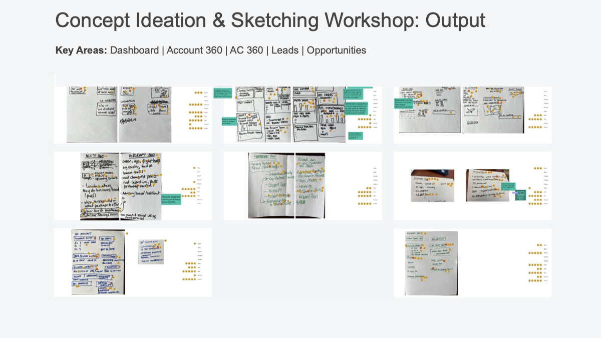
Concept sketching, whiteboarding, wireframe iterations, screen flows and a responsive prototype made it possible to review the end-to-end experience with stakeholders and technical partners before refining the detail.

Concept ideation and sketching workshop output for dashboard, account, aircraft, leads and opportunities
Concept ideation workshop
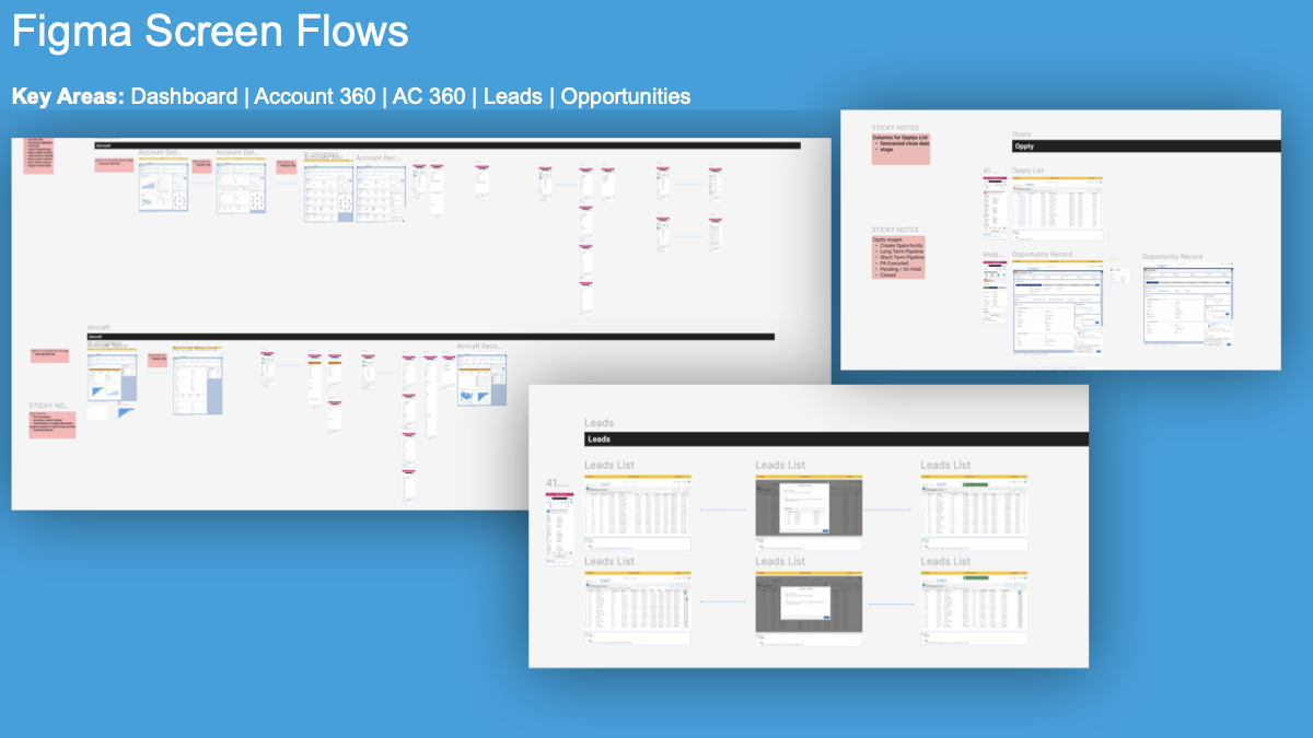
Figma screen flows for dashboard, account, aircraft, leads and opportunities
Figma screen flows

Alignment of metrics, context and next actions.

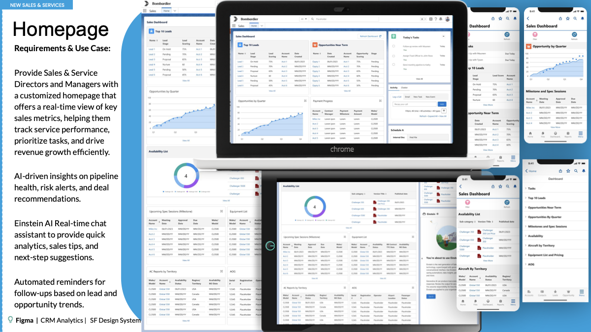
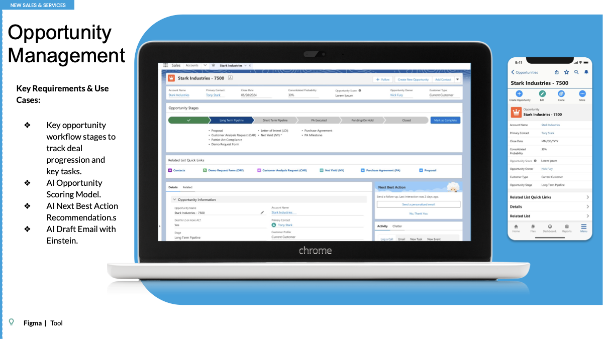
The final Salesforce experience gives Sales & Service Directors and Managers a real-time dashboard for metrics, service performance and task prioritization. AI-driven pipeline health, risk alerts, deal recommendations, a real-time Einstein assistant and follow-up reminders make the system more useful in the moment of work.

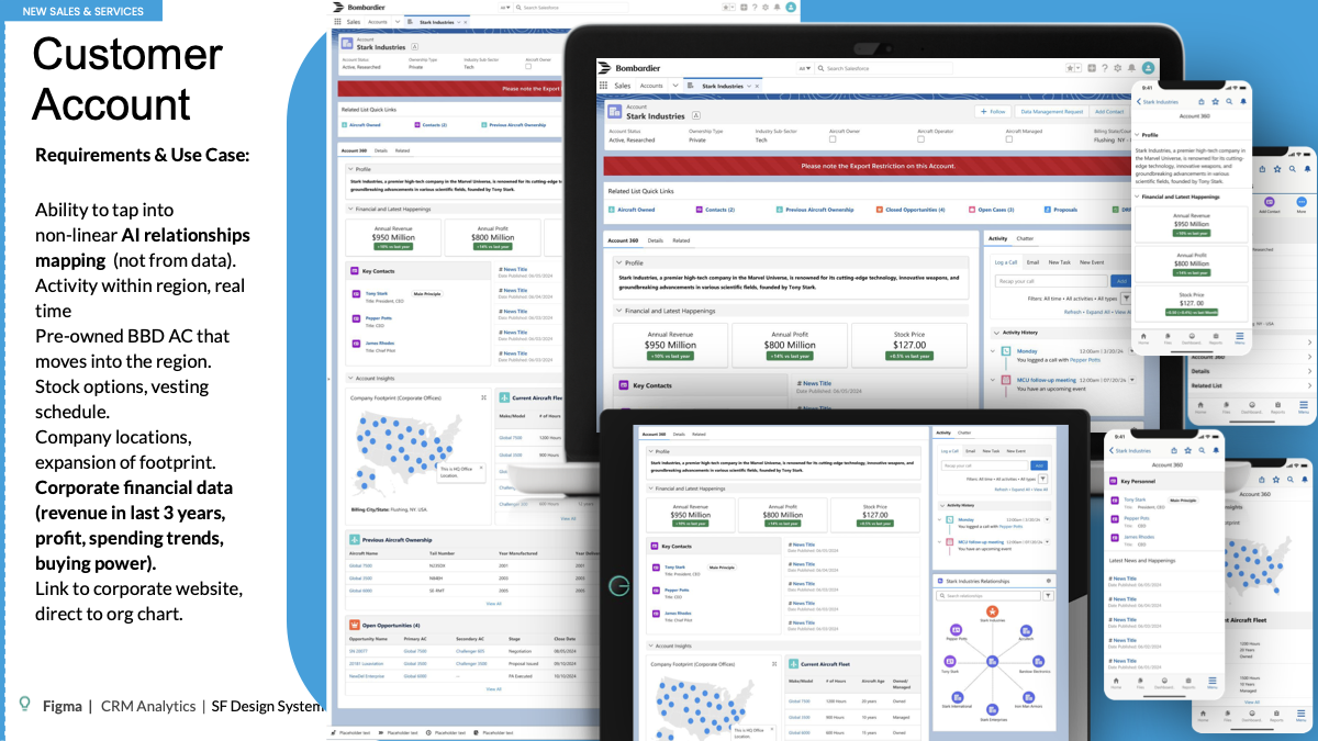
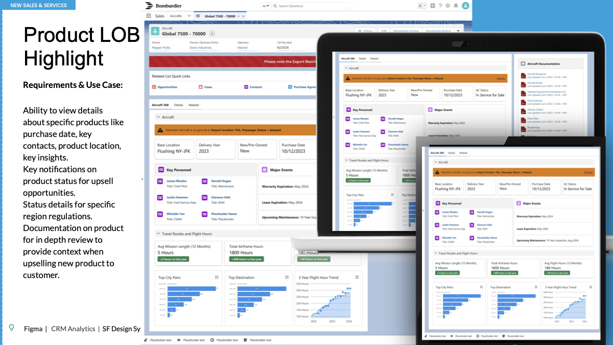
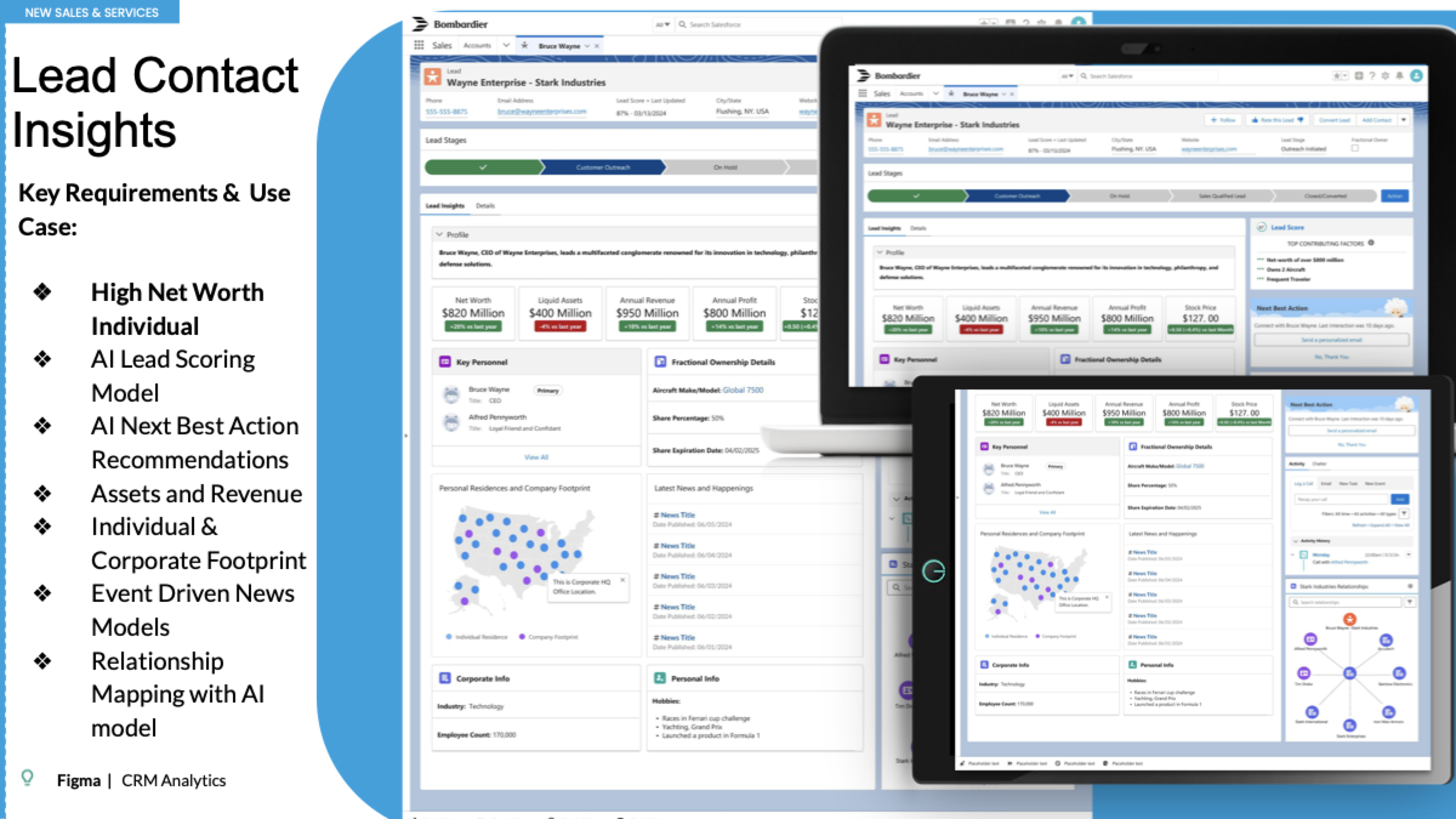
Account and aircraft views add the context needed for stronger conversations: customer relationships, corporate and financial information, product history, ownership, service details, documentation, regional considerations and signals for upsell opportunities. Lead and opportunity views extend the model with AI scoring, next-best-action recommendations and draft-email support.

Bombardier Salesforce dashboard across desktop and mobile
Decision-ready dashboard
Bombardier Salesforce customer account 360 experience across desktop, tablet and mobile
Customer Account 360
Bombardier Salesforce Aircraft 360 product view across devices
Aircraft and product context
Bombardier Salesforce opportunity management across desktop and mobile
Opportunity management
Bombardier Salesforce lead contact insights with AI scoring and next best actions
Lead insights and next-best actions

A more connected platform made workflow visible, complete and efficient.

The reported outcomes show improvements across workflow transparency, data quality, automation, Salesforce coverage, proposal creation and the Smart Services customer experience.

Visibility90%

Sales reps reported improved visibility into the customer journey.

Data quality99%

Reduction in missing or inaccurate customer-service data entries.

Automation80%

Customer reps reported a reduced workload burden.

Coverage100%

Data fields were made available in Salesforce.

Proposals50%

Less time was required to generate a new proposal.

Customer experience+5

CSAT score improvement for Elite Smart Services customers.

Back to top